Thursday, May 14, 2015

Cultural History and Theory - Truth, lies, validity, and the art world

In the third week of class we looked at a number of portraits and discussed what we thought of them, whether they were portraits or self-portraits and what information they conveyed.  As Some time has passed my memory of the class fades (the good reason these should be typed up the evening after!)

These are the images I remember:


"Wanted: $2,000 Reward" by Marcel DuChamp
http://face2face.si.edu/my_weblog/2009/06/wanted-2000-reward-by-marcel-duchamp.html

"Rrose Selavy" By Man Ray

"Portrait of Thea Proctor" by George Lambert
http://www.artgallery.nsw.gov.au/collection/works/309.2005/

"Self Portrait" by Thea Proctor
http://www.artgallery.nsw.gov.au/collection/works/DA8.1960/

There were undoubtably others that I have missed but these were the ones I recalled.

We then broke into groups and researched one of the images to quickly find out some background and information on the pieces and re-examined the images in light of the new understanding.

I'm not going to recount the discussion but from what I remember of it, each of the portraits shown revealed an element of deception and an element of truth often about both the subject and the artist. The question became whether multiple truths about the work could be seen as equally valid even if it appeared contrary to even what the artist intended the work to mean.

As homework for the lesson we did an exercise to find links between DuChamp, Man Ray, Max Dupain, and Sidney Nolan.  This was my answer:

The connection between Man Ray and Marcel Duchamp was explored in class, they were friends, and both involved in the Dada movement, there are many other connections such as they both made readymades, He assisted and/or collaborated on a number of projects with Duchamp, such as in the rotary glass plates.

Man Ray and Max Dupain can be connected from a quote by Max Dupain in a letter to the editor in sydney morning herald (30 March 1938) stating "Great art has always been contemporary in spirit. Today we feel the surge of aesthetic exploration along abstract lines, the social economic order impinging itself on art, the repudiation of the ‘truth to nature criterion’ … We sadly need the creative courage of Man Ray, the original thought of Moholy-Nagy, and the dynamic realism of Edouard Steichen" so it can be reasonably suggested that Man Ray was admired by Max Dupain and an influence in his work.

To make a connection between Max Dupain and Sidney Nolan seems easy, they both died in the same year, 1992, and both are counted amongst the Australian Surrealists, for dealing with surrealist themes and ideologies in their work. They were both involved with world war II and have both done works dealing with subject matter of war.

However wanting to dig a little deeper, and not finding much else to link them, I instead looked for a link from Sidney Nolan to Duchamp, and here is what I find an interesting link through Art historian Edmund Capon and his book "I blame Duchamp: My Life's Adventures in Art" published in 2009. The book is a collection of about 40 essays, in which he praises Sidney Nolan, and states his blame of Duchamp, at least partially, for bringing a dominance of conceptial art rather than aesthetic art into contemporary art

Wednesday, May 13, 2015

Cultural History and Theory - Critical Reading and Analysis

Have fallen behind in regular updates, due mainly to dealing and coping with things in my personal life, but getting things back on track now.  Hoping now to catch up specifically on posts for my Cultural History and Theory classes, by posting each day, and after that hopefully other classes as well, and then moving onto my own work.

Week 2 of Cultural History and Theory we looked at some critical reading skills.  We learned that it requires time and practice and that artists and designers need to engage in the process and use it at every opportunity to get the most benefit from it.  The process is to first read for understanding, and then to question that understanding by identifying key issues with the information.  Find examples of how the ideas can be backed up by evidence, and identify the bias both of the author and yourself, before putting the reading into context.


Article: Sleeping Beauty: Tilda Swinton Beds down in the name of art (again) 
Source: The Independent 
Author: Sam Masters
Key People: Sam Masters, the Author. No bio found for Sam Masters about credentials, or background, although they have written 33 articles in the Arts and entertainment category 

Having a look at a couple of these articles they also seem quite light on information and seem to point to the author's bias.  The Author seems to be an unreliable source of arts information.
Tilda Swinton The artist of this exhibit, and focus of the article
MoMA Spokesperson Commenting on the spontaneous nature of the exhibit in having no revealed scheduled dates.

Key Dates: 
24 march 2013 
9 September 1995 - Previous Performance

Focus of the Article: The focus of the article appears to be a comparison of the similarities with the Artist's exhibition 18 years earlier and the comment that little has changed.
The subtext of the article appears to show the bias of the author towards the artist, because the article seems to have a negative voice towards the exhibit, in that it seems to be saying that she has done this before, and there is little of interest.

Key ideas: Artist is wearing the same clothes as 1995 with the exception of glasses
The Artist did little to amuse crowds and did not provide supply scheduling information
Importance of this person/movement? This exhibit by Swinton appears to be important in the way it challenged viewers perceptions of what art is, and can be, and through that how it can be experienced.
The lack of artists statement for the exhibit meant that people took cues from the exhibit themselves analysing the objects that Swinton wore.

The Teacher went on to ask me the following questions:

"The lack of context with the exhibit, was it deliberate? why?"

The lack of context was deliberate, I believe the title of the exhibit itself gives the reason why.  "The Maybe" to me suggests a transitionally moment, it might be there or it might not, and the lack of context itself forces the observer, either those observing at the exhibit or those encountering it through other sources such as news articles are forced to come up with their own conclusions about the exhibit, which as the meaning has not been stated can only exist in the state of maybe being right.
"Do you think that art should be consumed without context? Why?"
I do not think that art as a generality should or should not be consumed with context, I believe that how an artwork should be consumed really depends on the message the artist is attempting to communicate with the piece.  I do believe that there is great value to Art provided without context, as it allows one to make their own connection to the piece and own conclusions as to the meaning, and without being able to confirm or deny that meaning it means their definition of the piece is as valid as any other observer. 

After this we had a critical look at three music videos; 99 Luftballons by Nena, God save the Queen by the sex pistols and 70 million by hold your horses.


Song: 99 Luftballons 
Artist: Nena 
Album: Nena 
Source: Youtube
Key People: 
Nena: Gabriele Susanne Kerner (Nena) – lead vocals - 
Nena means "little girl" 
Grew up in west Germany.
Jörn-Uwe Fahrenkrog-Petersen – keyboards, synthesizers, keytar, backing and lead vocals 
Carlo Karges – guitar, backing vocals 
Wrote the lyrics for the song, and conceived the idea for the song after releasing helium balloons and theorising how east German forces would react if crossing the wall.
Jürgen Dehmel – bass Rolf Brendel – drums, percussion
99 luftballons was their first major success.
Key Dates: 1983- date released Berlin wall was still in place at that time and Germany divided into east and west.
Focus:
The song was an anti-war protest song.
Balloons are mistaken for UFO and are shot down by the air force, which is mistaken as an invasion, and war is started destroying all in the process.
Destruction caused by misunderstanding, the ease with which war can be brought about. I believe that it relates to the devastation of World war 2, and the fears of an atomic war.
Key ideas:
The ease that War can be started from misunderstanding and miscommunication.
The futility of war's destruction.
Set in a battle field, the trenches of ww 1 and 2, highlighting the starkness of war.
Smoke grenades give the atmosphere of active war.
Moves to snowy forest showing isolation and survival.
Importance of this person/movement?
I believe this song was influential in highlighting the tensions in Germany over the Berlin wall, and its ongoing struggle to find its identity after the loss of World war II.


Song: God Save the Queen
Artist: Sex Pistols
Album: Nevermind the bollocks, here's the Sex pistols
Source: Youtube

Key People:
Johnny Rotton - Singer
Sid Vicious - Bass
Paul Cook - Drums
Steve Jones - Lead Guitar

Sex pistols were to become the quintessential British punk band.

The Queen Elizabeth II (and her fascist regime)
Peter Grugeon - Royal Photographer

Jamie Reid - Artist (did the cover image for the single)

Key Dates:
27 May 1977 - released
7 June 1977 - Jubilee holiday - band arrested for attempting to play the song on "The Queen Elizabeth"

Key ideas:
Was unable to find out where the video was recorded but it appears to be filmed in a pub sort of atmosphere, as a live performance, even though no crowd is shown in the video.

Background is mainly black except for the union jack flag with the queen's head postered on it, with censor bars that give the title of the song and the bands name. The original portrait photo of the queen that was used was taken by Royal photographer Peter Grugeon. The cover for the single, used the Jubilee Portrait of the queen but flipped and with a safety pin through her lip, and was created by Jamie Reid. I believe Jamie Reid also created the image in the music video, as one source mentioned his use of newspaper words and letters similar to those used in ransom notes, and that is not evident in the single cover. One source about the image questioned the legality of the images, describing the defacing of the queens image was illegal under the treason laws, but I have been unable to find any other reference to other such laws and as far as I can discover no legal action was taken over the image.

The key ideas in the lyrics are the song is suggesting that the monarchy government in England at that time was fascist, due to the class divide and poor treatment and living conditions for the working class. I believe this is emphasised in the use of censorship bars in the image, suggesting control over what the people could see, and through that express.

Focus:
Repression and poor living conditions of the British working class in industrial England.
The class divide between the rich, ruling class and the working class.

Importance of this person/movement?

This sex pistols and this song specifically was highly influential in the punk movement in the late seventies where it hit its height, through until today where it has split into several sub-genres.

The song peaked at number two of the UK charts, and due to the controversial nature of the song at the time, rumours have persisted that it outsold the number one song of that time (Rod Stewart's I don't want to talk about it) but was kept at number two to avoid upsetting the royal family.


Song: 70 Million
Artist: Hold your Horses
Album: Sorry! Household
Source: Youtube

Key People:
Hold your Horses:
Robin Pearson - Guitar and Vocals
James Penny - Bass
Chris Rourse - Drums

Band split up in 2014 stating that it had come to a natural conclusion.

Leonardo DaVinci
Sandro Botticelli
Michelangelo
Caravaggio
Rembrandt
Diego Velazquez
Johannes Vermeer
Jacques-Louis David
Theodore Gericault
Eugene Delazroix
Edouard Manet
Vincent Van Gogh
Gustav Klimt
Joseph Chagall
Piet Mondrian
Frida Kahlo
Rene Magritte
Andy Warhol
Pablo Picasso

Key Dates:
Feb 26 2010 - date that the video was uploaded on youtube

Key ideas:
The video goes on recreates several works throughout art history from renaissance paintings such as Leonardo's Last supper, through to the twentieth century with Picasso's portrait of Dora Maar, and Andy Warhol's portraits of Marilyn Monroe.

I have been unable to find a reference to the title 70 million, so I can only speculate onto its meaning to the artist. I think that it may refer to rich private collectors, that seek to own artworks like those shown in the video, not because they get the painting, or will enjoy viewing it, but for the dollar value of the piece, as an investment.

Focus:

I believe the focus of this song and music video is to encourage people to love life, to go out and experience their life and the world around them, to experience art and the feelings these works evoke. I think that their intention in recreating these works was to bring attention back to them, as well as to breath new life into the works and draw a new audience to experience it.

Importance of this person/movement?
The youtube video for 70 million has 2,126,347 so the song has had a large exposure.

This song is part of the L'Ogre movement, of which I have been able to little information about, however finding http://logre.tv/home/ I believe the movement is about bringing new life, and highlight the meaning of artists from history, by creating a video highlighting their work, sometimes this is recreation of their work in real life, such as in the video by Hold your horses, but also as an interpretation of their work, or series of work such as the video Sade at the musee d'orsay (NSFW): https://www.youtube.com/watch?v=z4eDdjIiIaI

To my surprise the band actually responded to my email and clarified that the title "70 million" refers to the population of the UK (or France), and the song related to people seeing the world differently from each other.  He also advised that the video was not their idea, but was that of the video's director and doesn't bare direct relevance to the song and its lyrics.

Friday, April 3, 2015

March Paintings

Here are the paintings I completed through March, its been a busy and fantastic month, starting to get into the good stuff at CIT, and really looking forward to the future projects :) The first term is now pretty much finished.  Next week we go on an excursion up to Sydney for the day visiting three galleries which should be awesome, and I'm really looking forward to getting into painting next term :)


Wednesday, March 18, 2015

30 Drawing Challenge

In my Drawing Investigation class, our first assignment was to complete the 30 drawings challenge, and here are the drawings I completed for it and my notes:

1. Yourself

Medium: Cigarette ash using cigarette butts, the rain, on warped wood
Notes: Process happened for me quite organically when I noticed the shape the rain had made with the cigarette ash, I then slowly started to create the head using the extinguished cigarette butts over time.  Mixing ash with water you could create a wash which happened naturally in this case, but overall not a great medium to work with, as it would be quite toxic.  Interestingly with rain over time the head seems to rotate, wish I took some photos after the last rain (and before the current one) to show this.

2. Animal

*Drawing is currently at CIT so I've only got the low res image taken from my camera phone, will replace when I take my camera in.
Medium: Willow charcoal and blending stump.
Notes: Did this drawing in class when we brought in an item to draw, I enjoy using charcoal with its rich darkness and I find it good with the stump to create different tone.

3. Food
Medium: Tomato Sauce with squeeze bottle
Notes: Did this one while waiting for Chicken nuggets to cook.  Tomato sauce is not really a good medium, with lines they tend to gel into each other and its hard to get any tone with it.  Perhaps if mixed with mayonnaise, you could get some nice warm tones.

4. Place
Medium: Willow Charcoal, Pencil and Oil Pastel on paper
Notes: For place I wanted to explore a connection to the land itself, and so chose the aboriginal memorial as inspiration for this piece, and drew an abstract of my feelings for the land in Canberra.
Again really enjoy the willow charcoal, and used pencil to give it some lighter grays, and the pastels some earthy colours.

5. Friend
Medium: Ink, with dropper and nail
Notes: Didn't really feel that successful with this one, using ink in this process was hard to control, I liked the effect of the drawing but didn't really get what I was after.

6. Book Character
Medium: Digital - Corel Painter Pastels
Notes: For this I chose the comic book character John Constantine for the hell blazer series by DC Comics (Vertigo).  I found the pastel brushes good, although not what I am used to so took some experimentation.

7. Word
Medium - Digital - Corel Painter - Digital Ink
Notes: For this I wanted to use the word to create the image, I chose digital ink for the because I thought that fit in with language usually being written or printed in ink.  I experimented with many of the brushes under the digital ink, but only found a few that were good to work with.


8. Animated Character
Medium: Digital - Corel Painter - Charcoal and Conte brushes
Notes: I chose Peppa Pig for the animated character, a favorite of my daughter.  using a square conte brush was interesting, somewhat difficult at times to get the line you want.

9. TV Show
Medium: Digital - Corel Painter - Markers
Notes: For TV show I chose Vikings by the history channel.  I found the marker brushes somewhat difficult to get a handle on, as they often went darker than expected.

10. A sweet
Medium: Oil Pastel
Notes: For this one I wanted to use pastels without blending them as I would normally do, but to instead try and find expression in the line and mark making. 


11. Turning point in your life


Medium: Compressed Charcoal and Stump
Notes: For this one I chose when my daughter and her mother came home from the hospital, and they were both relaxing on the couch.  Like with Willow charcoal I enjoyed using compressed charcoal, although I found willow to be richer in texture and easier to use, although I seem to get a better line with compressed charcoal, and the different grades made making different tonal ranges easier.


12. Recent Accomplishment
Medium: Graphite Pencil and stump
Notes: For this I chose to depict me letting go of pain surrounding my separation from my partner, still in the process, but this was letting a lot of it go.  Not much experimenting here as I've used pencil a lot, but it is a medium I enjoy to use.

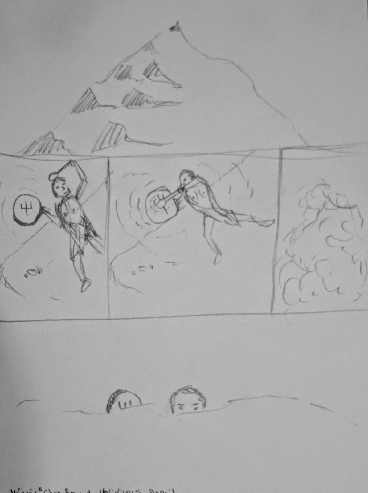
13. Comic
Medium: Graphite Pencil
Notes: I used Pencil for this one as I wanted to pay homage to the first stage in design for comic creation, the pencilling, although I understand a lot of this process is now done digitally.

14. Fairytale
Medium: Ballpoint Pen
Notes: For fairytale I chose to depict an initial scene from the frog prince, where the princess loses her ball.  Like with Pencil, I really seem to like sketching with ballpoint pen, they are cheap, replaceable and usually at hand.  Like with ink there is also that sense of permanence to the drawing, which makes you either think carefully about the line making or about how to use errant marks to enhance the drawing.

15. Family picture
Medium: Oil Pastel, Stump and Pen
Notes: For this one I chose to depict myself and my daughter when she was a baby, and try to get a sense of connection here.  I really liked the combination of pen and pastel, to me the line gives the softness of the pastel a focus and draws the image together.

16. Inspiration
Medium: Ball point Pen, microliner pen, Copic Marker and Watercolour pencils
Notes: With this one I really wanted to depict an exchange in relation to inspiration, and I see it as inspiration both entering into the figures eye and leaving it in a cycle.  Really liked the mix in mediums here, although I need a lot more practice with colour pencil, and possibly a larger range of colours.

17. Plant
Medium: Ball point pen, Copic Marker, and Microliner pen
Notes: I really liked the mix of pens in this one, the copic marker is really good in laying down areas of tone.

18. Just a doodle
Medium: Ball point Pen
Notes: I chose Ball point pen for this one to go along with the theme of doodle.

19. Something new
Medium - Digital - Artrage -  Oils and Palette knife
Notes: For this one I thought I'd go for a ultrasound image, the idea of preparing for a new life, the birth of something new.  I was considering how painting differs from drawing, especially when in the digital medium both are really just changing pixels.

20. Orange
Medium: Digital - Photoshop - Hard and soft round.
Notes: Went for the obvious for this one, mainly because it was a good choice for practicing my digital shading in photoshop.

21. Something I want
Medium: Digital - Corel Painter - Colour Pencil Brushes + smudge
Notes: In this one I wanted to depict the outpouring of the self in creative expression.  I chose the colour pencil brushes because I wanted to see if I could get good vibrancy out of them and I am quite pleased with how it turned out.  Being a pencil medium it was sometimes difficult to get overlaying colours.

22. Something I miss
Medium: Oil Pastels
Notes: I miss closeness and intimacy.  I chose pastels for this because I thought their softness would suit the subject matter well.

23. Something I need
Medium: Ink with Brush and microliner pen
Notes: In this one I wanted to depict reintergration of the self.  Pulling oneself back together into a stable whole.  Really enjoy ink with a brush, I think it allows for great expressive lines.

24. A couple
Medium: Pastels
Notes: For this one I chose to do a rendition of Renoir's "Boating Couple".  
Again with this one I wanted to capture the marks without blending.
25. Scenery
Medium: Digital - Corel Painter - Digital Gel
Notes: for this one I wanted to play with the Gel brushes in painter, which to me seem a little in between watercolour and ink.  

26. Something I don't like
Medium: Marker and Microliner pen.
Notes: for this one I wanted to depict depression, often symbolised as a black dog.  With this one I wanted to play with the contrast of thick line and thin line, against the white of the page.

27. Someone I love
Medium: Compressed Charcoal and Watercolour Pencil
Notes: My Daughter.  For this I wanted to do a charcoal drawing but to try adding a little colour with pencil to draw interest.

28. Anything I like
Medium: Colour Pencil and Microliner pen
Notes: For this one I want to experiment using complimentary colours against thin black lines to try and depict something coming into harmony, a balance restored.

29. A place I want to go
Medium: Compressed Charcoal and Stump
Notes: Norway.  It was interesting trying to get the reflection in the water, but I needed to go softer in my strokes, as I think that has given the water a raised look.  

30. A congratulations Banner
Medium: Microliner Pen
Notes: I thought using the pen for this final one would work best, as it tied quite a few of the pieces together, I thought it deserved its own image.

We'll now be starting our major project of the unit (we move to painting next term) and I still think I will go for portraiture for mine, its an area I really enjoy, and need much improvement in.