Surreal Drawing Tutorial - The Cosmic Throne\

Tickets are still available for the showcase in Canberra on July 30, if you are interested please follow the link below:
http://www.rawartists.org/canberra/communique/?artist=219582
I usually do this in a traditional method, using paper, pen, pencil and marker, but for ease of uploading I am doing this tutorial digitally within Autodesk Sketchbook pro copic edition which is free to download and use (Download link below) but you can follow along either traditionally, or in the drawing program of your choice, it shouldn't effect the workflow.
Step 1. Set intention and title
As we will be working with automatic drawing and the subconscious I find this is one of the most important steps in the process as it provides a more clarity for the peice. What I like to do is when I am reading or looking through a book, I write down words or brief phrases which stand out to me. That way when I want to work on a new piece I just pick one from the list. For this one I have chosen "The Cosmic Throne", and I write that at the bottom corner of the page.Step 2. Composition and Perspective
I never worried too much about perspective with these in the past, but now I enjoy considering it and drawing a few lines for these, even if I end up ignoring it, I find if nothing else it helps me with the composition. While I find this step important for getting a good end result, it can be skipped if you just want to get onto the free drawing, and/or don't want the structure behind the drawing. Sometimes I skip it but usually I'll do this stage if I'm looking at completing a finished artwork.If you are not comfortable with composition and perspective, I recommend the CTRL Paint Video tutorials for getting more familar with the concepts.
Firstly I decide whether I will be using the whole page, or a smaller portion. This determines whether I draw a horizon line or the framing shape that the drawing will fit into, in this case I am going for the whole page, so I determine where the horizon line will be and mark it out in either pencil or biro.
Then I determine the focal point, often this will also be a vanishing point for the piece so that everything flows to that point, but it depends on the piece. I then draw some perspective lines from that point and then draw a circle to indictate that focal point.
I then like adding additional secondary focal points into the image to balance the image.

I then think about how I want the piece to flow, and draw in arrows or lines to indicate how I want the eye to move around the piece.

Step 3 Automatic Drawing
This step is a bit harder to explain, I like to start it by first taking a break, then when I sit down I take a deep breath and spend a few moments thinking about the title and theme of the piece, just letting the mind flow with it. I then roughly scribble over the image, trying to follow the guide lines I set in the step before, but just letting the hand flow. This should be very quick and rough, the idea is to let go of everything and pour everything onto the page. Don't worry about how it looks at this stage, as we'll refine, this is about getting energy into the piece. This may take some practice until you're comfortable about this and feel confident in the later steps to make the piece look better.I usually do this in pen or marker, because I look at it as the subconscious imprint upon the page and that every mark has an importance so this avoids the temptation to erase.

Step 4 Line Refining
This step I fill out the linework, this is the stage the picture starts to become clearer, and I find that I often have the feeling of exploration, as I discover the shapes and forms starting to appear from what in step 3 just looks like a mess.I tend to like black marker for this stage, but it depends on the piece, if I used biro for the above step, I might continue to use it, or I might go with a sepia or Sanguine pen
For this I'm using sketchbook copic so I'm using the Copic fine tip brush and the 110 Special black.
Now just trace the lines filling them out.


Its still most likely going to look like a mess of lines at this stage, but you should be able to see it starting to take form, and we will refine these shapes further in the next part...
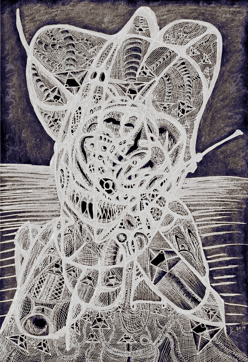
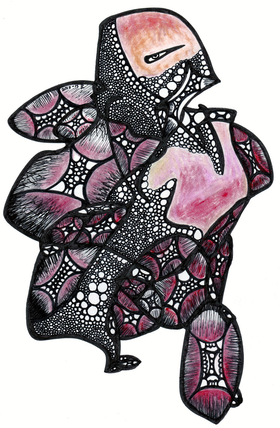
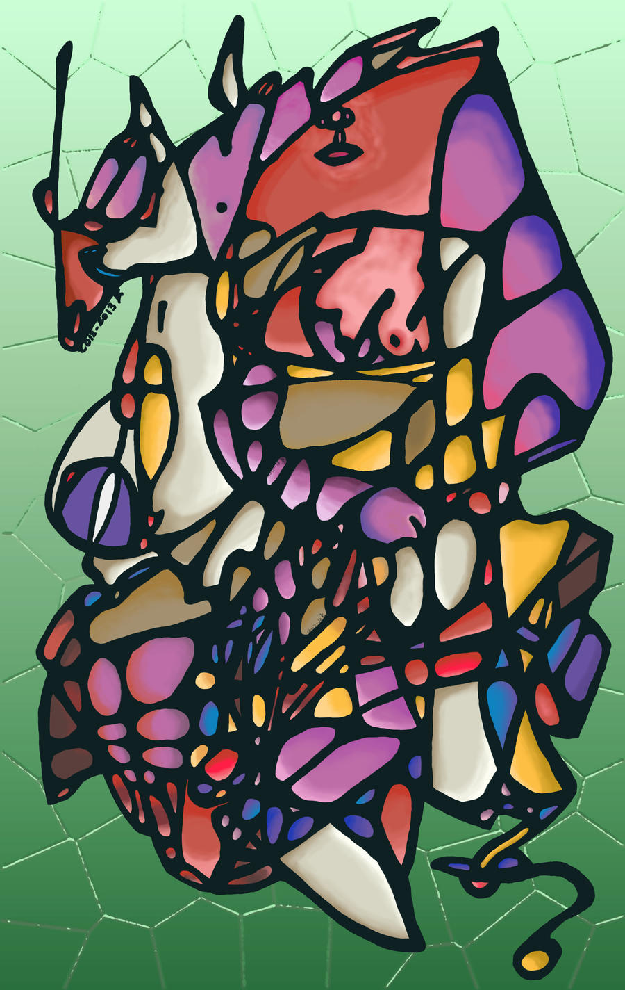
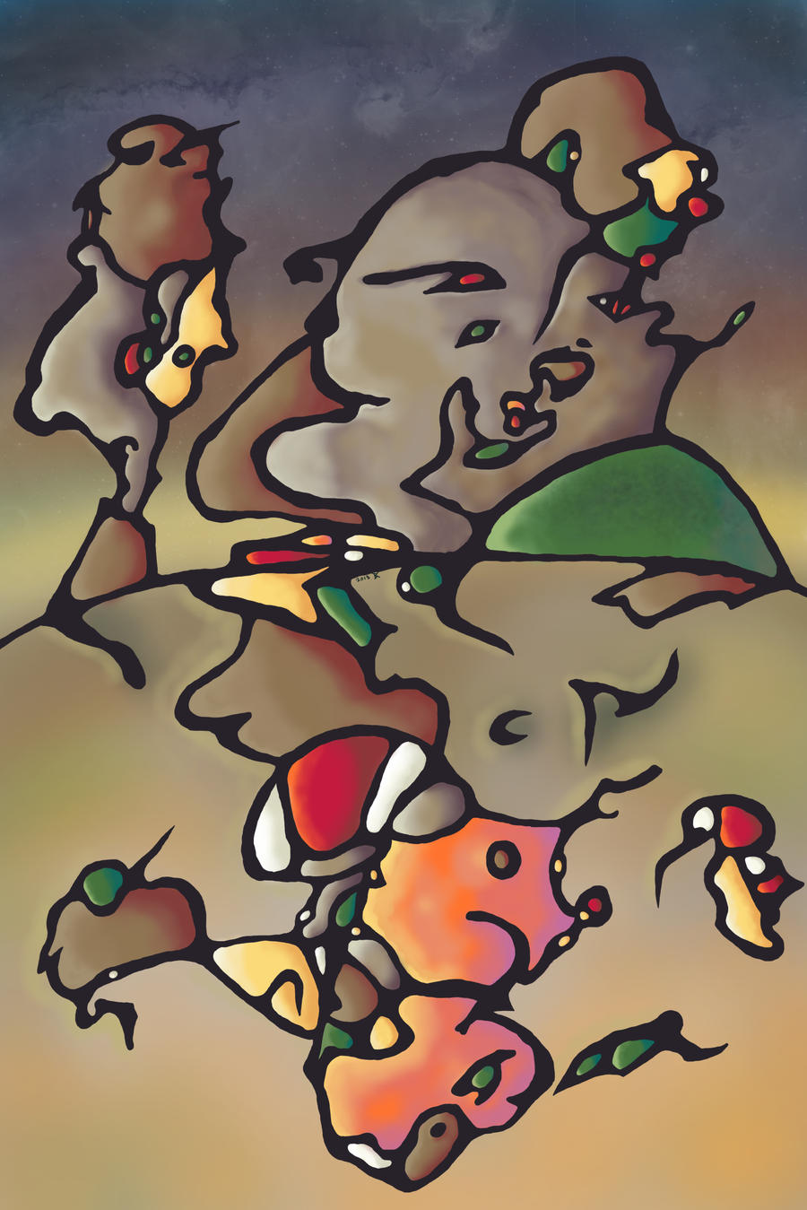
Here are some examples of past work I have done with various iterations of this method:
No comments:
Post a Comment